
Packaging, Branding and Corporate Identity for Murray's Pomade
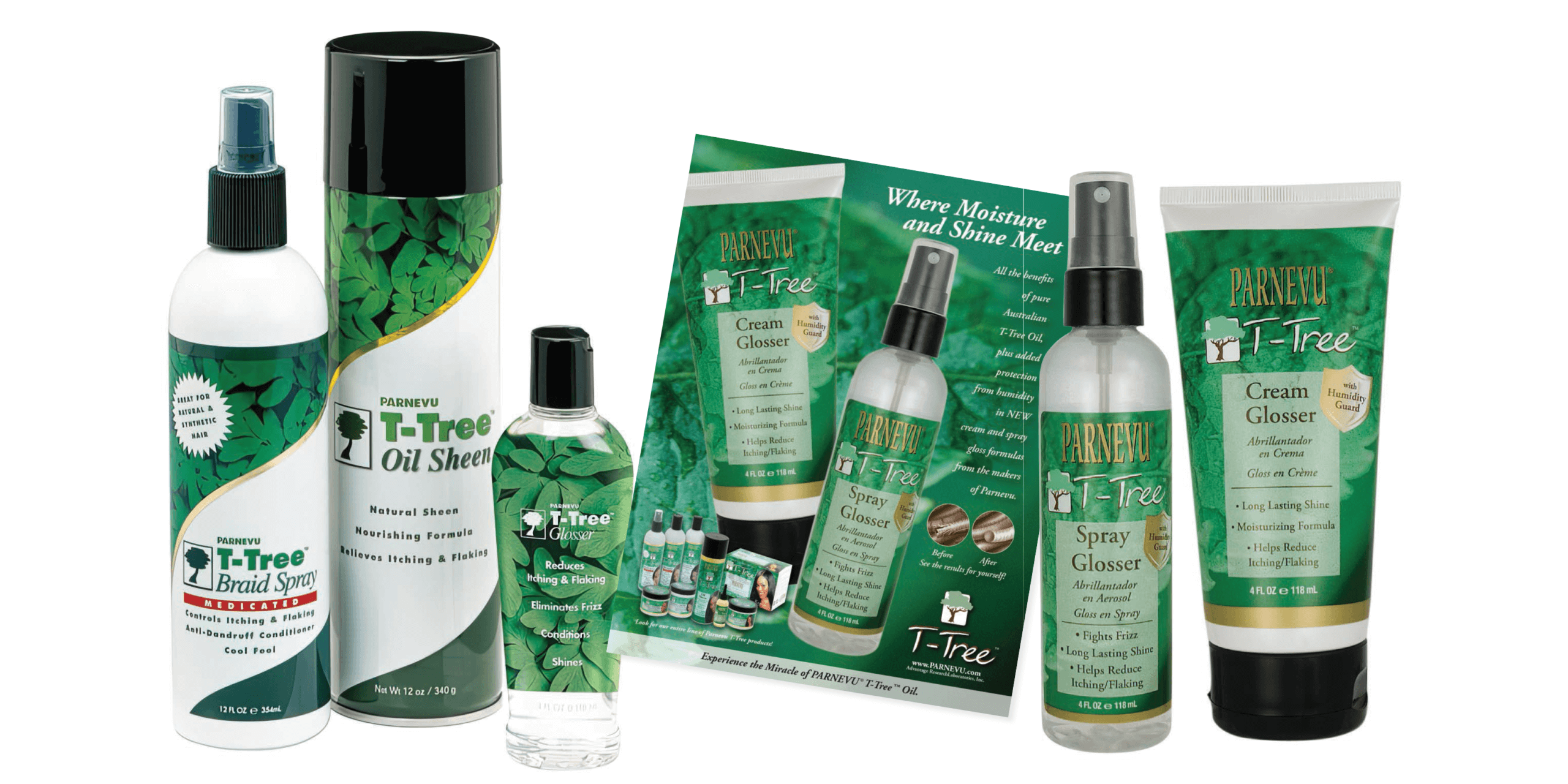
Packaging, branding and corporate identity for Murray's pomade and hair styling products evolves the iconic brand for today's customers. First developed in 1925, Murray's Superior Hair Dressing Pomade is still widely enjoyed by enthusiasts of sleek hair styles. Current product lines now include the popular Parnevu T-Tree family of hair care. Packaging for styling essentials include clear containers, mists, sprays, and tubes.
Anne Ink helped guide and refresh Murray's branding and corporate identity by changing with the times, from the iconic swish signature to the embellished oval shown above. The logo design reinforces brand identity and consumer sentiment by emphasizing brand heritage.
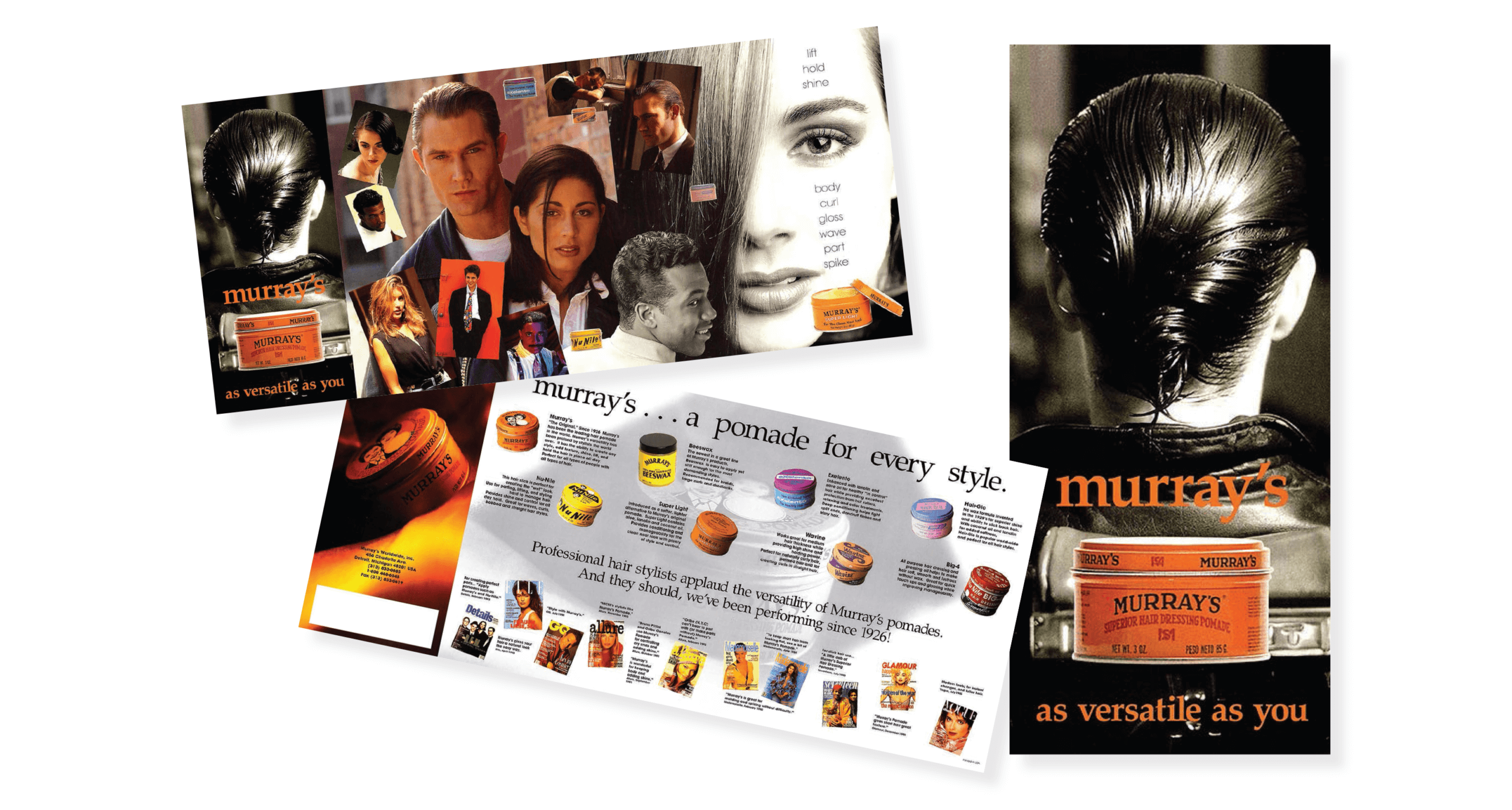
The collage pinup-style brochure shows the versatility of the brand and products across multiple demographics. Individual images are selected to capture the unique dynamic of the brand. Corporate identity printed materials consisting of letterhead, business cards and envelopes carry the established theme across presentations.


IMPACT AND SUCCESS STORY
Anne Ink developed packaging for multiple product lines such as Beeswax, Parnevu T-Tree, and Conditioner Pomades. Anne Ink was one of the first to use white ink labels on clear stock. We did this with the T-Tree Glosser to let the leaves artwork show through the packaging. Both the T-Tree Spray Glosser and Cream Glosser won awards for packaging design.
