

Campaign Branding Corporate Identity for Mercy High School Admissions
Campaign branding and corporate identity go hand in hand. The recruitment print materials use design that reinforces brand messaging for while staying true to the school's core values.
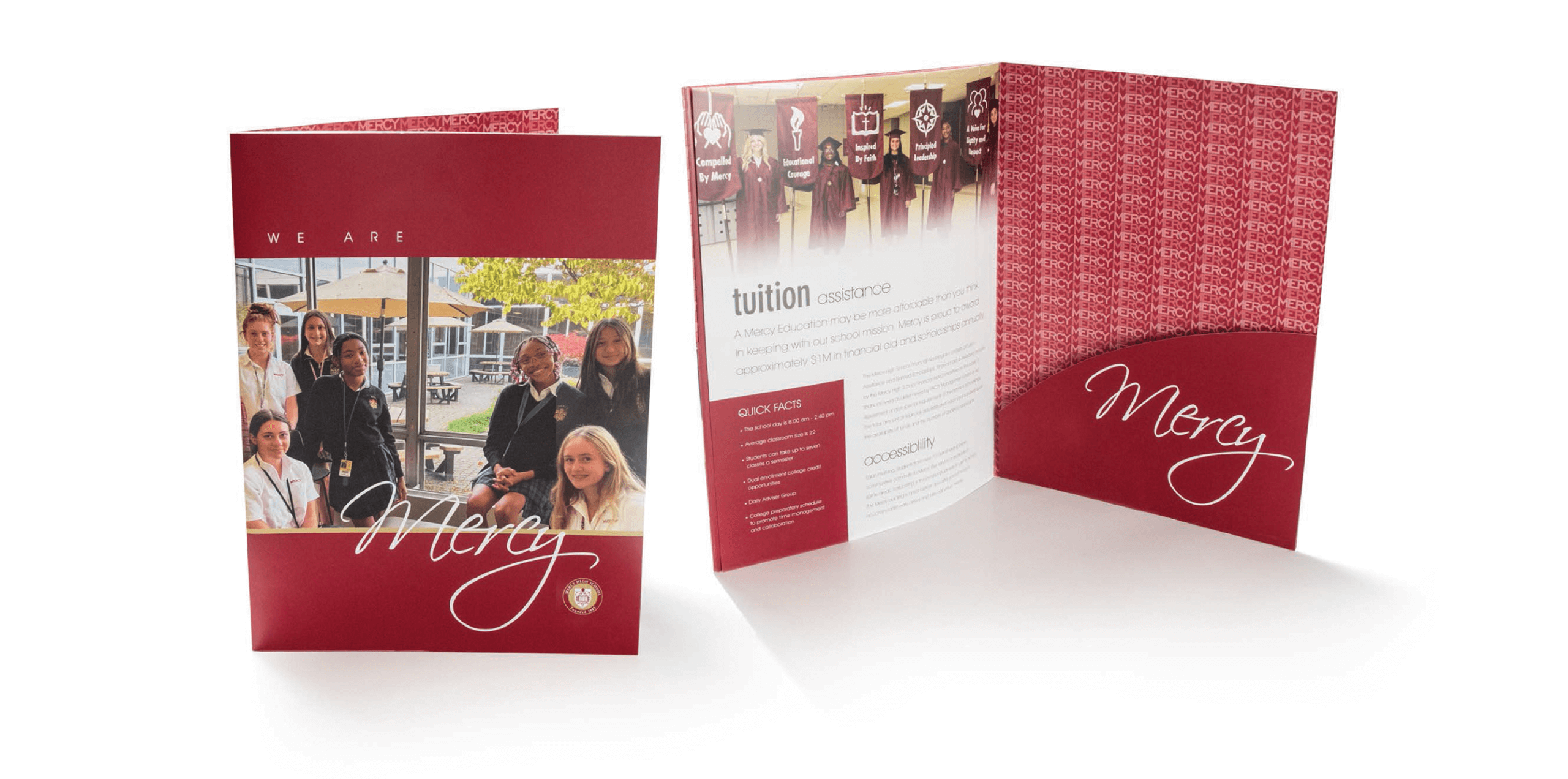
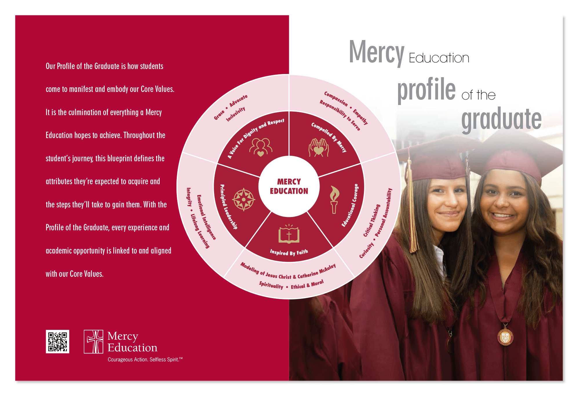
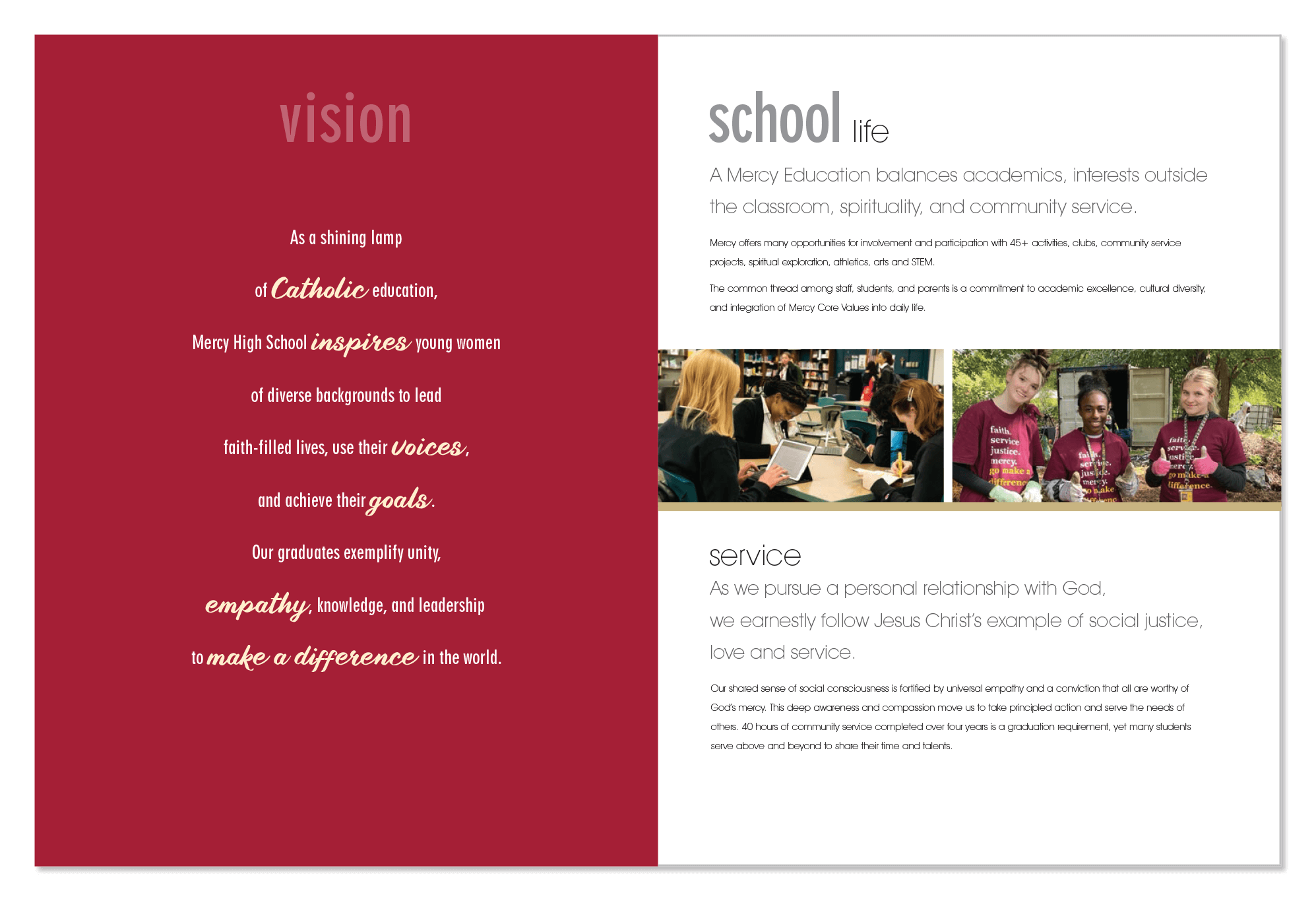
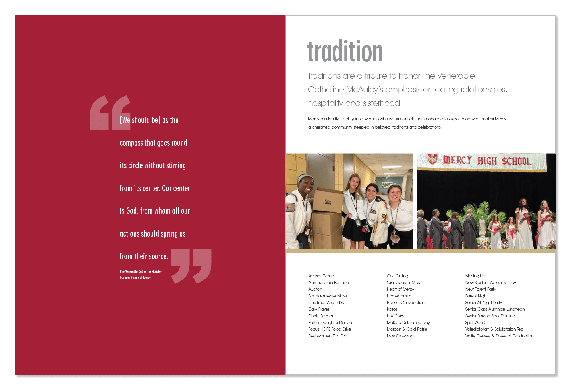
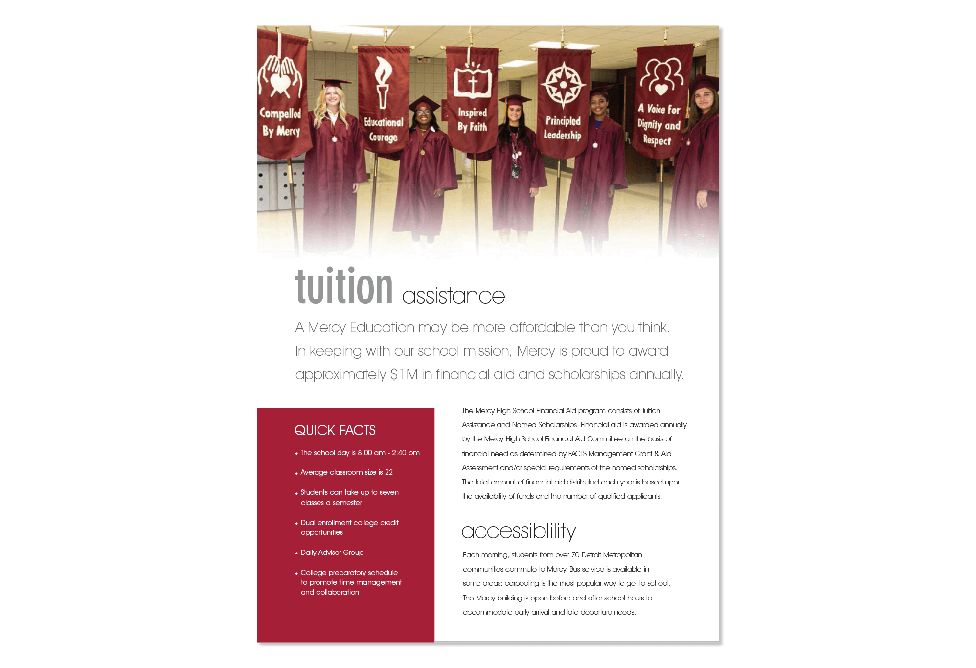
The design for the recruitment brochure pocket folder builds upon previous Capital Campaign branding success by using type as art. The font and word choice create a unique and recognizable pattern while reinforcing the Mercy brand identity. It's a perfect example of how understanding the school's mission allows for an end result that enhances the brand, identity, and impact. The inserts allow for easy updates while the pocket folder remains in use. Combined, the imagery and content unifies messaging with the campaign branding efforts.
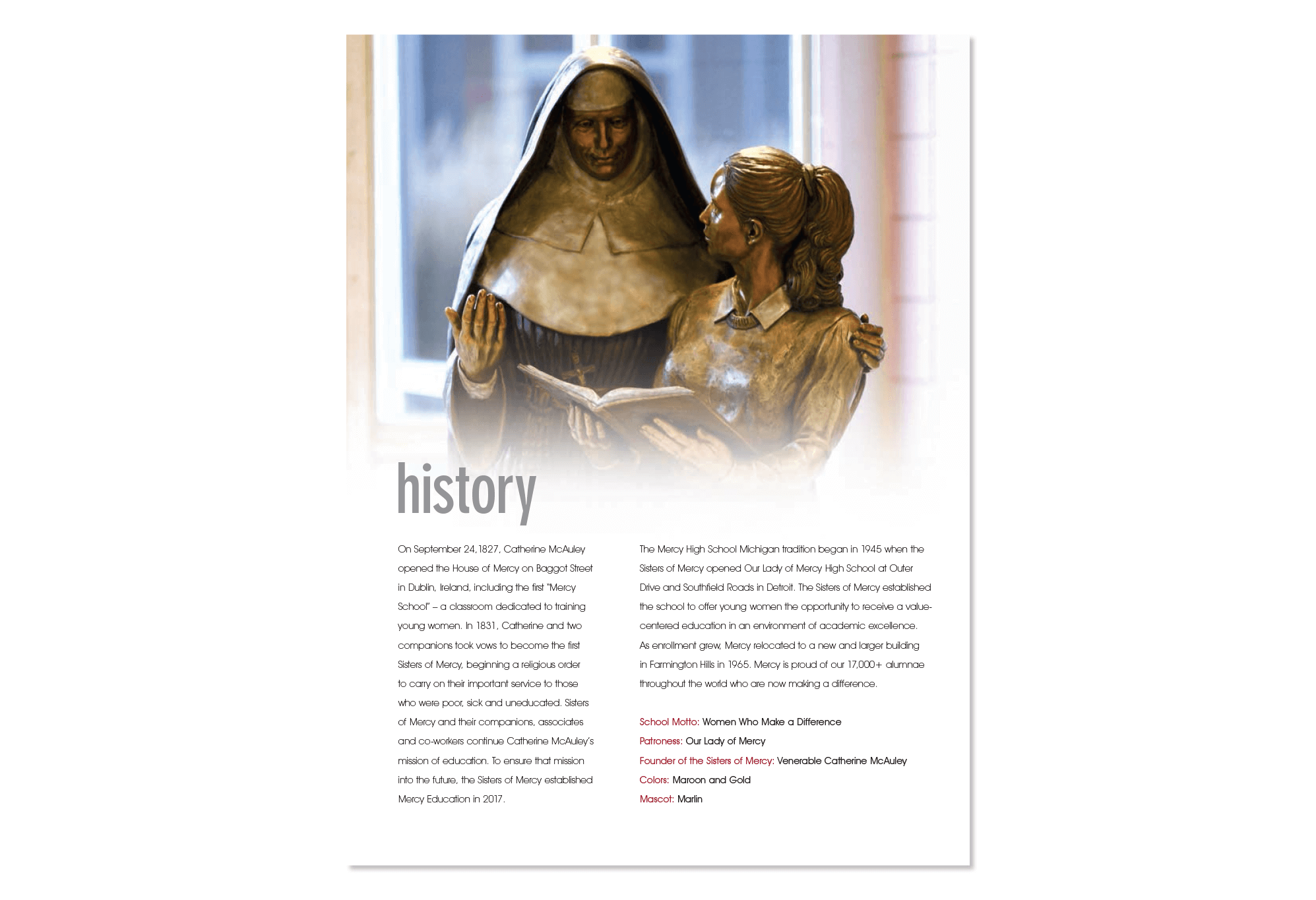
Mercy High School's corporate identity is rooted in the values evident since its inception in 1945. As Mercy evolves with the changing times, these values are constant and a reminder of their importance. The dedication of Mercy founder, Sr. Catherine McAuley, to the education of young women who make a difference has lasting impact on Mercy students. This tradition continues today with Mercy High School, where students and graduates readily identify with campaign branding visuals and corporate identity messaging.
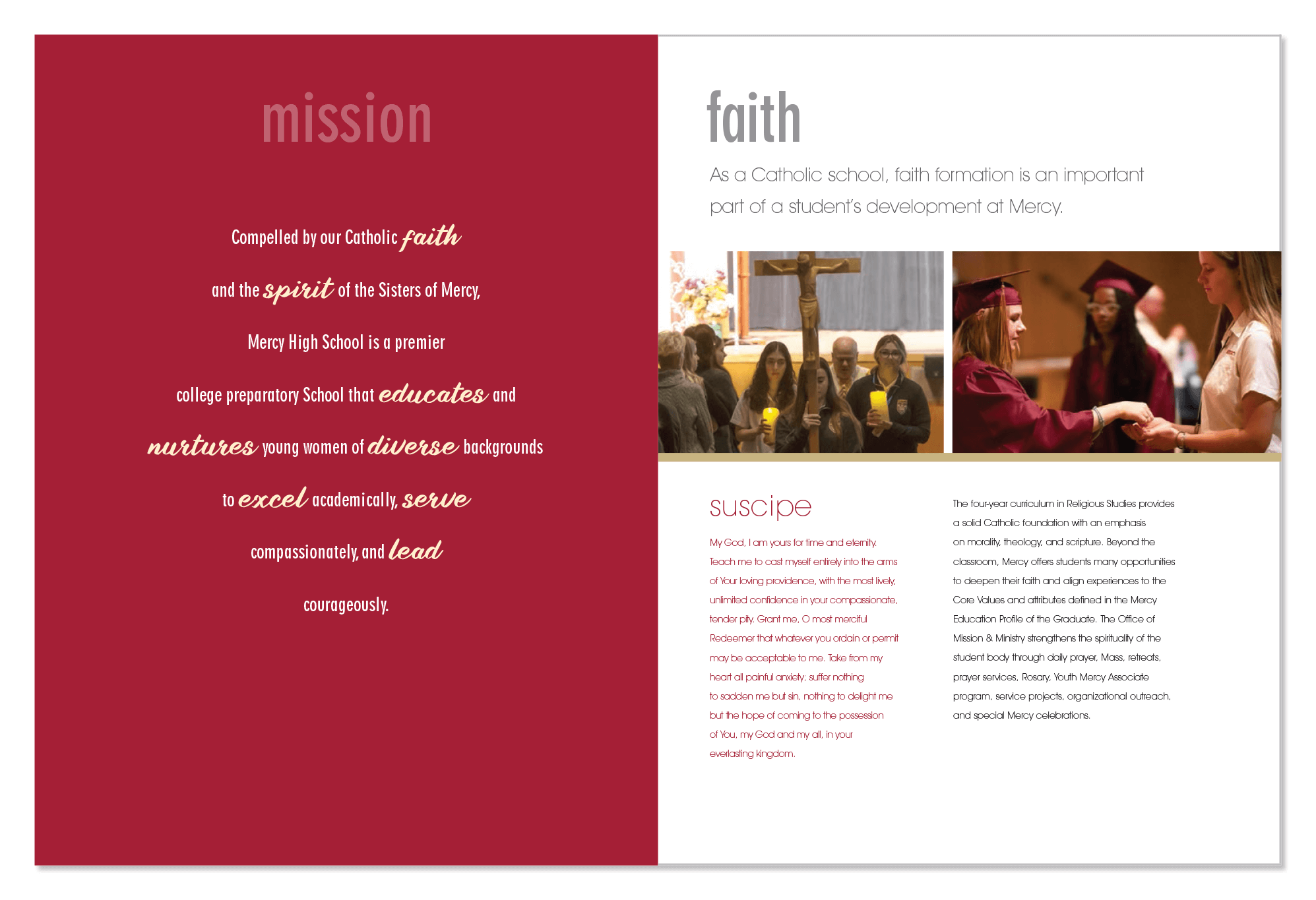
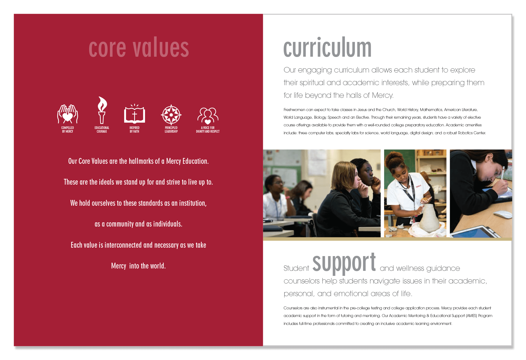
Layouts from the Brochure
IMPACT AND SUCCESS STORY
Creating a continuation of successful branding and positioning for Mercy High School is easy when the client understands the importance of cohesiveness and allows the visual story to be told in impactful ways. The result is purposeful and direct communication and messaging of the brand.
Explore Projects by Category
Graphic Design | Specialty Packaging | Websites | Programs | Publications
Product Development | Photography and Catalogs | Data Solutions | Personalized Mailers
Sustainability | Environmental Graphics | Campaigns | Advertising | Brand Identity
Magazines | Packaging | Rebranding | Invitations | Brochures
Fundraiser Events | Branding | Corporate Identity | Marketing | AI Design
